
Graph Visualization#
This guide demonstrates how to create and customize graph visualizations using the RelationalAI (RAI) Python API.
Table of Contents#
- Load Sample Data and Set Up a Model
- Visualize Data as a Graph
- Customize a Graph Visualization
- Export a Graph Visualization
- Display a Graph Visualization in Streamlit
Load Sample Data and Set Up a Model#
-
Execute the following to create
ACCOUNTSandTRANSACTIONStables in Snowflake and insert sample data into them:# import relationalai as rai # Create a Provider instance for executing SQL queries and RAI Native App commands. # NOTE: This assumes that you have already configured the RAI Native App connection # in a raiconfig.toml file. See the configuration guide for more information: # https://relational.ai/docs/develop/guides/configuration provider = rai.Provider() # Change to following to the schema where you'd like to create the source tables. SCHEMA_NAME = "RAI_DEMO.GRAPHVIS" # ====================================== # DO NOT CHANGE ANYTHING BELOW THIS LINE # ====================================== DATABASE_NAME = SCHEMA_NAME.split(".")[0] provider.sql(f""" BEGIN -- Create the database if it doesn't exist CREATE DATABASE IF NOT EXISTS {DATABASE_NAME}; -- Create the schema if it doesn't exist CREATE SCHEMA IF NOT EXISTS {SCHEMA_NAME}; -- Create or replace the ACCOUNTS table CREATE OR REPLACE TABLE {SCHEMA_NAME}.ACCOUNTS ( NAME STRING, ACCOUNT_TYPE STRING ); -- Insert data into ACCOUNTS table INSERT INTO {SCHEMA_NAME}.ACCOUNTS (NAME, ACCOUNT_TYPE) VALUES ('Paul', 'business'), ('Terri', 'business'), ('Sarah', 'business'), ('Jessica', 'business'), ('Josh', 'business'), ('Kendra', 'business'), ('Tracy', 'business'), ('Mery', 'business'), ('Kristina', 'business'), ('Rachel', 'business'), ('Steven', 'business'), ('Stacey', 'business'), ('Joseph', 'business'), ('Karen', 'business'), ('James', 'business'), ('Jacqueline', 'business'), ('Joann', 'business'), ('Amber', 'personal'), ('Alice', 'personal'), ('Brian', 'personal'), ('Debra', 'personal'), ('David', 'personal'), ('Allison', 'personal'), ('Deborah', 'personal'), ('Frank', 'personal'), ('Charles', 'personal'), ('Amanda', 'personal'), ('Danielle', 'personal'), ('Charlie', 'personal'), ('Bob', 'personal'), ('Elise', 'personal'), ('Ashley', 'personal'), ('Brandi', 'personal'), ('Eve', 'personal'), ('Hayley', 'personal'), ('Felicia', 'personal'); ALTER TABLE {SCHEMA_NAME}.ACCOUNTS SET CHANGE_TRACKING = TRUE; -- Create or replace the TRANSACTIONS table CREATE OR REPLACE TABLE {SCHEMA_NAME}.TRANSACTIONS ( SOURCE_ACCOUNT STRING, TARGET_ACCOUNT STRING, AMOUNT NUMBER, DATE DATE ); -- Insert data into TRANSACTIONS table INSERT INTO {SCHEMA_NAME}.TRANSACTIONS (SOURCE_ACCOUNT, TARGET_ACCOUNT, AMOUNT, DATE) VALUES ('Paul', 'Ashley', 569, '2024-06-22'), ('Amber', 'Kendra', 3988, '2024-02-16'), ('Alice', 'Charles', 1507, '2024-03-23'), ('Brian', 'Steven', 4539, '2024-08-02'), ('Brian', 'Joann', 1526, '2024-05-27'), ('Terri', 'Brandi', 1416, '2024-01-18'), ('Sarah', 'Rachel', 3351, '2024-10-08'), ('Jessica', 'Bob', 1000, '2024-10-20'), ('Josh', 'Mery', 668, '2024-09-09'), ('Kendra', 'Joseph', 3987, '2024-07-24'), ('Amber', 'Debra', 2665, '2024-02-29'), ('Tracy', 'Joann', 4531, '2024-05-19'), ('Mery', 'Sarah', 807, '2024-08-17'), ('Danielle', 'Sarah', 1277, '2024-09-28'), ('Amber', 'Kristina', 2510, '2024-03-18'), ('Ashley', 'Kristina', 1641, '2024-05-13'), ('Amber', 'Tracy', 2496, '2024-04-13'), ('Debra', 'Rachel', 2502, '2024-09-29'), ('Bob', 'David', 2649, '2024-08-30'), ('Paul', 'David', 4283, '2024-06-03'), ('Kristina', 'Ashley', 3712, '2024-03-12'), ('Jacqueline', 'Debra', 953, '2024-01-06'), ('Joseph', 'Elise', 1283, '2024-09-19'), ('Ashley', 'Eve', 662, '2024-05-12'), ('Amber', 'Hayley', 792, '2024-06-02'), ('Danielle', 'Brian', 2737, '2024-01-29'), ('David', 'Hayley', 1992, '2024-03-02'), ('Allison', 'Felicia', 2022, '2024-01-27'), ('Deborah', 'David', 3627, '2024-09-09'), ('Charlie', 'Stacey', 4455, '2024-01-26'), ('Frank', 'Karen', 4186, '2024-07-22'), ('Rachel', 'Brandi', 4620, '2024-02-02'), ('Brian', 'Terri', 977, '2024-08-18'), ('James', 'Joseph', 2782, '2024-10-06'), ('Karen', 'Hayley', 1561, '2024-07-18'), ('Elise', 'David', 3609, '2024-01-22'), ('Terri', 'Karen', 3219, '2024-10-12'), ('Steven', 'Danielle', 1866, '2024-06-24'), ('David', 'Brian', 4694, '2024-05-12'), ('Jessica', 'James', 4795, '2024-10-09'), ('Stacey', 'Kristina', 4069, '2024-01-05'), ('Karen', 'Felicia', 1799, '2024-10-11'), ('Ashley', 'Hayley', 1617, '2024-04-07'), ('Alice', 'Ashley', 2790, '2024-06-18'), ('Mery', 'Charlie', 3139, '2024-08-21'), ('Frank', 'Mery', 4991, '2024-02-23'), ('Jessica', 'Paul', 1506, '2024-10-11'), ('Charles', 'Amber', 4545, '2024-04-23'), ('Amanda', 'Sarah', 4705, '2024-08-27'); ALTER TABLE {SCHEMA_NAME}.TRANSACTIONS SET CHANGE_TRACKING = TRUE; END; """) -
Define a model with
AccountandTransactiontypes populated with entities from theACCOUNTSandTRANSACTIONSSnowflake tables:# # Create a model named 'SampleTransactions' model = rai.Model('SampleTransactions') # Define types from the ACCOUNTS and TRANSACTIONS tables. Account = model.Type('Account', source=f"{SCHEMA_NAME}.ACCOUNTS") Transaction = model.Type('Transaction', source=f"{SCHEMA_NAME}.TRANSACTIONS") # Define sender and receiver properties on the Transaction type that reference # the Account type by mapping the source_account and target_account columns to # the name property of the Account type. Transaction.define( sender=(Account, "source_account", "name"), receiver=(Account, "target_account", "name"), ) -
Add rules to calculate the total amount sent and received by each account.
# from relationalai.std import aggregates as agg # Set the amount_sent and amount_received properties on each Account entity by # summing the amounts of transactions where the Account is the sender or receiver. with model.rule(): account = Account() account.set( amount_sent=agg.sum(Transaction(sender=account).amount, per=[account]), amount_received=agg.sum(Transaction(receiver=account).amount, per=[account]), ) # Set the total_amount property on each Account entity by summing the amount_sent # and amount_received properties. with model.rule(): account = Account() account.set(total_amount=account.amount_received + account.amount_sent) # Rank accounts by total amount in descending order. with model.rule(): account = Account() account.set(rank=agg.rank_desc(account.total_amount)) # Set a total_amount property on each Transaction entity by summing the amounts # of all transactions per sender-receiver pair. with model.rule(): txn = Transaction() txn.set(total_amount=agg.sum(txn.amount, per=[txn.sender, txn.receiver])) # Rank transactions by total amount in descending order. with model.rule(): txn = Transaction() txn.set(rank=agg.rank_desc(txn.total_amount))
Visualize Data as a Graph#
Create a graph with nodes that represent accounts and edges that represent transactions and use the .visualize() method to display an interactive graph visualization:
#from relationalai.std.graphs import Graph

# Create a graph object from the model. The graph is directed by default.
graph = Graph(model)

# Extend the node set with nodes that represent Account entities with properties from the model.
graph.Node.extend(
    Account,
    name=Account.name,
    rank=Account.rank,
    total_amount=Account.total_amount,
    account_type=Account.account_type,
)

# Add edges to the graph that represent Transaction entities with properties from the model.
with model.rule():
    txn = Transaction()
    edge = graph.Edge.add(from_=txn.sender, to=txn.receiver)
    edge.set(rank=txn.rank, total_amount=txn.total_amount)

# Visualize the graph.
fig = graph.visualize()

# Open the interactive visualization in a Jupyter or Snowflake notebook.
fig.display(inline=True)
In a non-interactive environment, like a Python script, you can call .display() without the inline parameter to open the interactive visualization in a new browser tab.
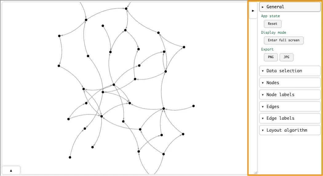
The visualization looks something like this:
There is some randomness in the layout of the nodes and edges, so graph visualizations may look different each time you run the code.
Notice the buttons at the top-right and bottom-left corners of the visualization window. These buttons open the settings panel and the details panel, respectively.
The Settings Panel#
Click the top-right button in the interactive visualization window to open the settings panel:
Use this panel to select data to display on the graph, adjust node and edge sizes, change the graph layout, and export the visualization as a PNG or JPG image.
The Details Panel#
Click the bottom-left button in the interactive visualization window to open the details panel:
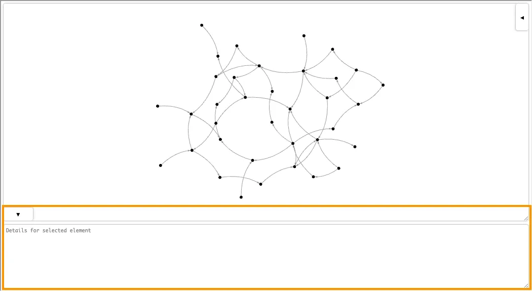
When you click on a node or an edge in the graph, details about that item are displayed here. See Set the Node Style and Set the Edge Style for information on how to customize the details displayed in this panel.
Customize a Graph Visualization#
You may customize the appearance of the graph visualization by setting styles for nodes and edges. There are two ways to set node and edge styles:
-
Pass a style dictionary to the
graph.visualize()method. For example, the following visualizes the graph with orange nodes and blue edges:# # ... Model and graph setup code ... graph.visualize(style={ "node": {"color": "orange"}, # Set the color of the nodes. "edge": {"color": "blue"}, # Set the color of the edges. }) -
Set properties on nodes and edges in the graph object with rules. For instance, the following code produces the same visualization as above:
# # ... Model and graph setup code ... with model.rule(): node = graph.Node() node.set(color="orange") # Set the color of the node. with model.rule(): edge = graph.Edge() edge.set(color="blue") # Set the color of the edge. # Visualize the graph. graph.visualize()
In both cases, the visualization looks like this:
In general, using a style dictionary is preferable since it decouples the visualization style from the graph data and is more performant.
Note that you may combine both methods if you want to set some styles using a style dictionary and others by setting properties on nodes and edges.
Keys in the style dictionary override properties set on nodes and edges.
Set the Node Style#
Nodes can be styled by setting the following attributes, either in the style dictionary or by setting properties on nodes in the graph object:
| Attribute | Description | Type |
|---|---|---|
color | The color of the node. | HTML color name (ex: "blue") or RGB hex string (ex: "#0000FF") |
opacity | The opacity of the node. | Number between 0 and 1 |
size | The size of the node. | Positive number |
shape | The shape of the node. | One of "circle", "rectangle", or "hexagon" |
border_color | The color of the node’s border. | HTML color name or RGB hex string |
border_size | The width of the node’s border. | Positive number |
label | The text label for the node. | String |
label_color | The color of the node label. | HTML color name or RGB hex string |
label_size | The size of the node label. | Positive number |
hover | Text shown in a pop-up tooltip when hovering over the node. | String |
click | Text shown in the details area when clicking on the node. | String |
x | The x-coordinate to fix the note at. Can be released in the UI. | Number |
y | The y-coordinate to fix the note at. Can be released in the UI. | Number |
z | The z-coordinate to fix the note at. Can be released in the UI. Only used in 3D visualizations. | Number |
Here’s an example that sets a custom style for the nodes:
#style = {
    "node": {
        "color": "blue",
        "size": lambda n: n.get("rank", 10),
        "label": lambda n: n.get("name", "n/a"),
        "label_size": 20,
        "hover": lambda n: f"Rank: {n.get('rank', 'n/a')}",
        "click": lambda n: f"Type: {n.get('account_type', 'n/a')}\nTotal Amount: {n.get('total_amount', 'n/a')}",
    },
    "edge": {"color": "gray"}
}

fig = graph.visualize(
    style=style,
    use_node_size_normalization=True,  # Normalize node sizes for better visualization.
)

fig.display(inline=True)
Notice that node properties are accessed in lambda functions using the Python dictionary .get() method.
Behind the scenes, the .visualize() method queries the RAI model for the graph data and stores the result as a dictionary, so properties are accessed as dictionary keys and not as object attributes.
You may access the dictionary used by .visualize() by calling the graph.fetch() method.
Set the Edge Style#
Edges can be styled by setting the following attributes, either in the style dictionary or by setting properties on edges in the graph object:
| Attribute | Description | Type |
|---|---|---|
color | The color of the edge. | HTML color name (ex: "blue") or RGB hex string (ex: "#0000FF"). |
opacity | The opacity of the edge. | Number between 0 and 1 |
size | The line width of the edge. | Positive number |
label | The text label for the edge. | String |
label_color | The color of the edge label. | HTML color name or RGB hex string |
label_size | The size of the edge label. | Positive number |
hover | Text shown in a pop-up tooltip when hovering over the edge. | String |
click | Text shown in the details area when clicking on the edge. | String |
Here’s an example that sets a custom style for the edges:
#style = {
    "node": {
        "color": "gray",
        "size": 20,
    },
    "edge": {
        "color": "orange",
        "size": lambda e: e.get("total_amount", 1),
        "hover": lambda e: f"Total Amount: ${e.get('total_amount', 'n/a')}",
        "click": lambda e: f"Rank: {e.get('rank', 'n/a')}\nTotal Amount: {e.get('total_amount', 'n/a')}",
    }
}

fig = graph.visualize(
    style=style,
    use_edge_size_normalization=True,  # Normalize edge sizes for better visualization.
)

fig.display(inline=True)
Apply Styles Conditionally#
Styles can be applied conditionally to nodes and edges. For example, the following code applies different shapes and colors to nodes and edges based on their account type and rank:
#style={
    "node": {
        # Color nodes violet if their rank is less than or equal to 5, otherwise cyan.
        "color": lambda n: "violet" if n.get("rank", 100) <= 5 else "cyan",
        "size": lambda n: n.get("total_amount", 1),
        # Display nodes as triangles if their account type is business, otherwise circles.
        "shape": lambda n: "triangle" if n.get("account_type") == "business" else "circle",
        "label": lambda n: n.get("name", "n/a"),
        "label_size": 20,
    },
    "edge": {
        # Color edges orange if their rank is less than or equal to 5, otherwise gray.
        "color": lambda e: "orange" if e.get("rank", 100) <= 5 else "gray",
        "size": lambda e: e.get("total_amount", 1),
    },
}

fig = graph.visualize(
    style=style,
    use_node_size_normalization=True,
    use_edge_size_normalization=True
)

fig.display(inline=True)
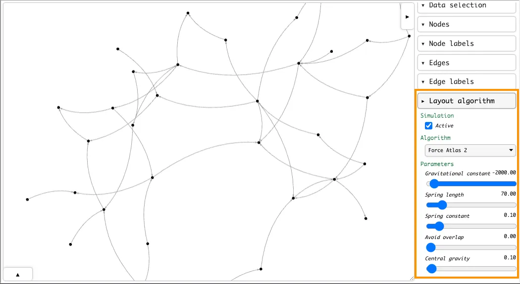
Change the Graph Layout Algorithm#
The default layout algorithm used to visualize graphs is Barnes-Hut, which is a force-directed layout algorithm that uses the Barnes-Hut approximation to speed up computation.
You can change the layout of the graph by setting the .visualize() method’s layout_algorithm parameter.
The following layout algorithms are available:
| Algorithm | Description |
|---|---|
barnesHut | A force-directed layout algorithm that uses the Barnes-Hut approximation to speed up computation (Default). |
forceAtlas2Based | A force-directed layout algorithm based on the ForceAtlas2 algorithm. |
repulsion | A force-directed layout algorithm that uses repulsion forces to position nodes. |
hierarchicalRepulsion | A hierarchical force-directed layout algorithm that uses repulsion forces to position nodes. |
Additional keyword arguments can be passed to further customize the layout:
| Argument | Description | Default | Supported Algorithms |
|---|---|---|---|
gravitational_constant | The strength of the force between all pairs of nodes. | -2000.0 | barnesHut, forceAtlas2Based |
central_gravity | The strength of the force that pulls nodes towards the center of the graph. | 0.1 | All |
spring_length | The desired distance between connected nodes. | 70.0 | All |
spring_constant | The strength of the spring force between connected nodes. | 0.1 | All |
avoid_overlap | The strength of the collision force that acts between nodes if they come too close to each other. | 0.0 | barnesHut, forceAtlas2based, hierarchicalRepulsion |
Here’s an example that uses the forceAtlas2Based layout algorithm:
#graph.visualize(layout_algorithm="forceAtlas2Based")
Note that you may adjust layout parameters in the interactive visualization’s settings panel after executing the code:
Visualize Graphs in 3D#
You can make three-dimensional graph visualizations by setting the .visualize() method’s three parameter to True:
#style = {
    "node": {
        "color": lambda n: "violet" if n.get("rank", 100) <= 5 else "cyan",
        "size": lambda n: n.get("total_amount", 1.0),
        "label": lambda n: n.get("name", "n/a"),
    },
    "edge": {
        "color": lambda e: "orange" if e.get("rank", 100) <= 5 else "gray",
        "size": lambda e: e.get("total_amount", 1.0),
    }
}

fig = graph.visualize(
    three=True,  # Visualize the graph in 3D.
    style=style,
    use_node_size_normalization=True,
    use_edge_size_normalization=True,
)

fig.display(inline=True)
Only the Barnes-Hut layout algorithm is supported for 3D visualizations. You can customize the layout using the following keyword arguments, or by using the interactive visualization window’s settings panel:
| Argument | Description | Default |
|---|---|---|
use_many_body_force | Whether to use the many-body force in the layout. | True |
many_body_force_strength | Number that determines the strength of the force. Positive numbers cause attraction and negative numbers cause repulsion between nodes. | -70.0 |
many_body_force_theta | Number that determines the accuracy of the Barnes–Hut approximation of the many-body simulation where nodes are grouped instead of treated individually to improve performance. | 0.9 |
use_many_body_force_min_distance | Whether to apply a minimum distance between nodes in the many-body force. | False |
many_body_force_min_distance | Number that determines the minimum distance between nodes over which the many-body force is active. | 10.0 |
use_many_body_force_max_distance | Whether to apply a maximum distance between nodes in the many-body force. | False |
many_body_force_max_distance | Number that determines the maximum distance between nodes over which the many-body force is active. | 1000.0 |
use_links_force | Whether to use the links force in the layout. This force acts between pairs of nodes that are connected by an edge. It pushed them together or apart it order to come close to a certain distance between connected nodes. | True |
links_force_distance | The preferred distance between linked nodes. | 50.0 |
links_force_strength | The strength of the links force. | 0.5 |
use_collision_force | Whether to use the collision force in the layout. This force treats nodes as circles instead of points and pushes them apart if they come too close to each other. | False |
collision_force_radius | The radius of the circle around each node. | 25.0 |
collision_force_strength | The strength of the collision force. | 0.7 |
use_centering_force | Whether to use the centering force in the layout. This force pulls nodes towards the center of the graph. | True |
Export a Graph Visualization#
Graph visualizations may be exported as a standalone HTML file that can be viewed in a web browser, or as a PNG or JPG image.
Export a Standalone HTML File#
To export a standalone HTML file, call the .export_html() method on the figure object returned by the graph.visualize() method:
#fig = graph.visualize()

# Export the visualization as a standalone HTML file.
# NOTE: Without overwrite=True, an error is raised if the file already exists.
fig.export_html("visualization.html", overwrite=True)
The HTML file contains the full interactive visualization window.
Export a PNG or JPG Image#
You can export a graph visualization as a PNG or JPG image from the settings panel of the interactive visualization window:
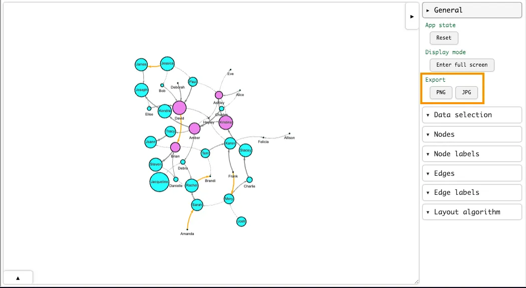
You may also export PNG or JPG images programmatically by calling the .export_png() or .export_jpg() methods on the figure object returned by the graph.visualize() method:
To export a graph visualization:
#fig = graph.visualize()

# Export the visualization as a PNG image.
# NOTE: Without overwrite=True, an error is raised if the file already exists.
fig.export_png("visualization.png", overwrite=True)

# Export the visualization as a JPG image.
fig.export_jpg("visualization.jpg", overwrite=True)
Programmatically exporting graph visualizations requires the selenium package and is not supported in Snowflake notebooks.
Display a Graph Visualization in Streamlit#
Graph visualizations can be displayed in Streamlit apps using the st.components.v1.html component.
You must use the st.components.v1.html component to display graph visualizations in Streamlit apps.
The st.html component does not support the Javascript required to render the visualization.
For example:
#import relationalai as rai
from relationalai.std import as_rows
from relationalai.std.graphs import Graph
import streamlit as st
import streamlit.components.v1 as component


PERSON_DATA = [
    {"id": 1, "name": "Alice"},
    {"id": 2, "name": "Bob"},
    {"id": 3, "name": "Carol"},
    {"id": 4, "name": "David"},
]

FOLLOWS_DATA = [
    (1, 2),
    (1, 4),
    (2, 1),
    (2, 3),
    (3, 4),
    (4, 3),
    (4, 1),
]


# =========
# RAI MODEL
# =========

with st.spinner("Loading model and visualizing graph..."):
    model = rai.Model("SocialNetwork")
    Person = model.Type("Person")
    Follows = model.Type("Follows")

    # Add people to the model.
    with model.rule():
        data = as_rows(PERSON_DATA)
        Person.add(id=data["id"]).set(name=data["name"])

    # Add follows relationships to the model.
    with model.rule():
        data = as_rows(FOLLOWS_DATA)
        person1 = Person(id=data[0])
        person2 = Person(id=data[1])
        Follows.add(from_person=person1, to_person=person2)

    # Create a directed graph from the model.
    graph = Graph(model)

    # Add Person entities to the graph's node set.
    graph.Node.extend(Person, name=Person.name)

    # Define edges from the Follows relationship.
    with model.rule():
        follows = Follows()
        graph.Edge.add(follows.from_person, follows.to_person)

    # Visualize the graph.
    fig = graph.visualize(style={
        "node": {
            "color": "lightblue",
            "size": 30,
            "label": lambda n: n.get("name", "n/a"),
        },
        "edge": {"color": "gray"},
    })


# ==============
# STREAMLIT APP
# ==============

# Create a title component.
st.title("Social Network Graph")

# Display the graph in an HTML component.
component.html(fig.to_html(), height=500)